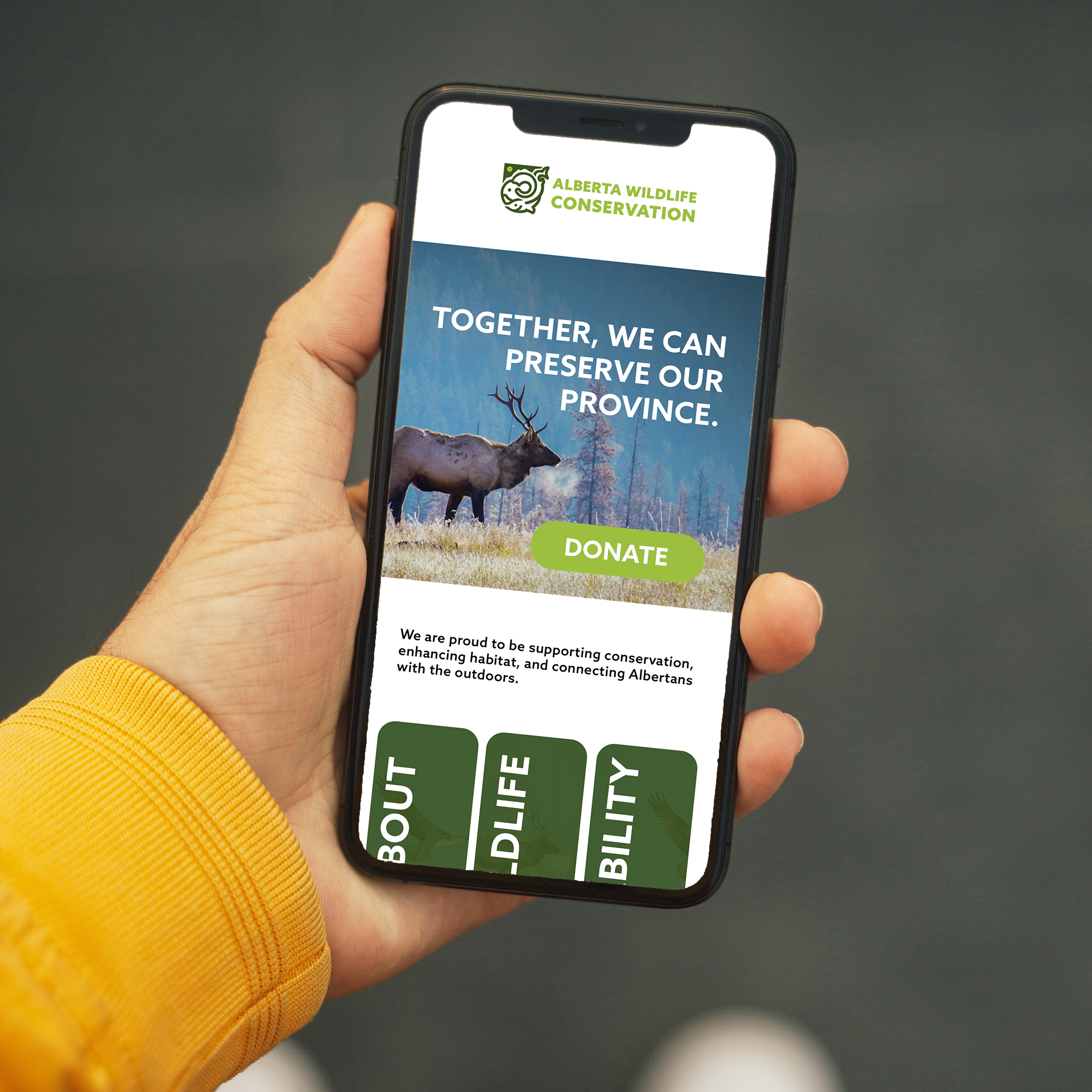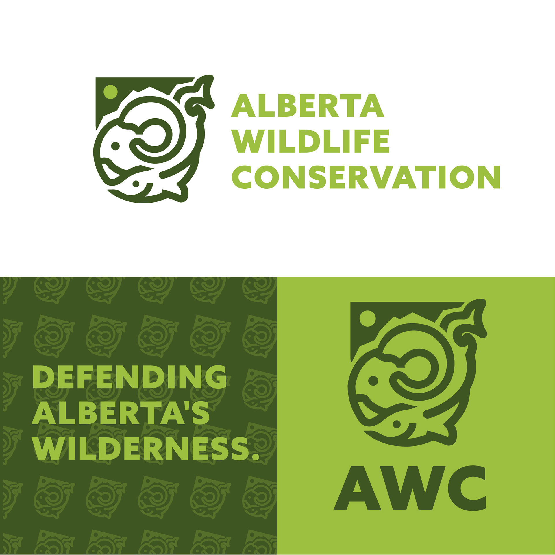
For this mock conservation brand, I set out to create an identity that reflects Alberta’s landscape, wildlife, and the organization’s role in protecting both. The logo centres around a shield—a universal symbol of protection—representing the organization’s commitment to safeguarding Alberta’s habitats and natural resources. Within the shield, stylized wildlife elements reference animals iconic to the province, grounding the brand in a strong sense of place.
A deep, earthy green was chosen as the primary colour to evoke growth, stability, and environmental stewardship. Paired with a clean, mature typeface, the overall identity feels grounded, trustworthy, and enduring. This visual system conveys both strength and care which are qualities essential for any organization dedicated to conservation.